Your design dictionary.
If you’re not a UI/UX designer and you found yourself starting to build products and websites with AI, it can be hard to describe exactly what you have in mind. You know what it looks like in your head, but you don’t have the vocabulary to verbalize it to your AI assistant. So we made it easier for you and put everything you need to know in a dictionary, so you can build the design of your dreams.
Style
Character is the overall personality of the site, and every other choice should express it. You can define a website’s character along different character dimensions, or aesthetic labels to describe the overall look and feel of your site.
Each dimension runs between two opposites. Very few sites sit at an extreme; most lean one way, and six to eight of these leanings are enough to describe a whole character.
Serious
Plain language, no jokes, nothing that could read as flippant. The subject is treated as important.
Playful
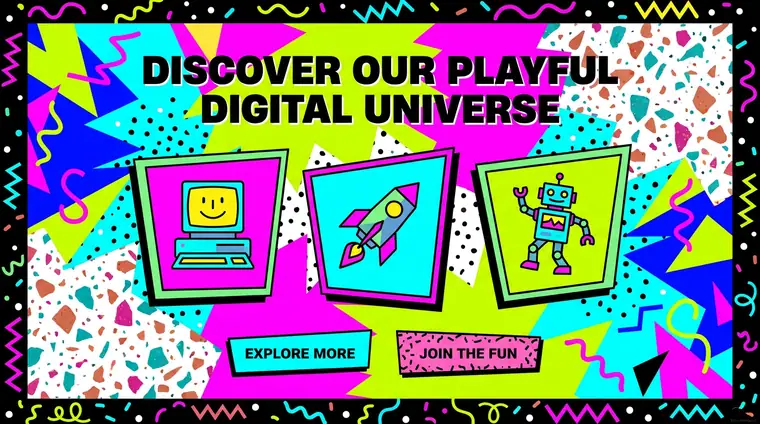
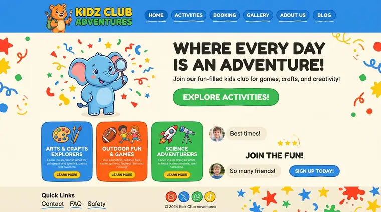
Humour, surprise and small rewards are welcome — a joke in a button, an animation that exists only to delight.
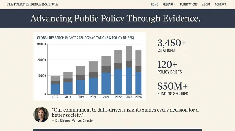
Authoritative
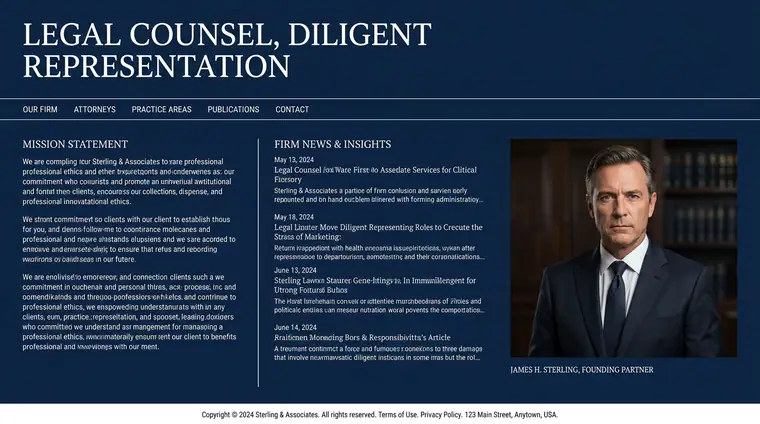
Speaks from expertise. Declarative sentences, evidence, no hedging and little small talk.
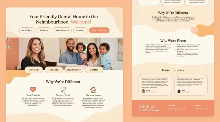
Friendly
Speaks as a peer who has done it before. Contractions, questions and the occasional aside.
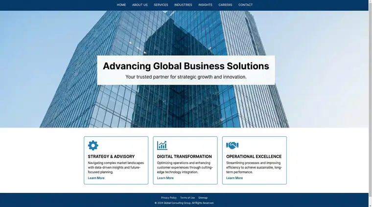
Corporate
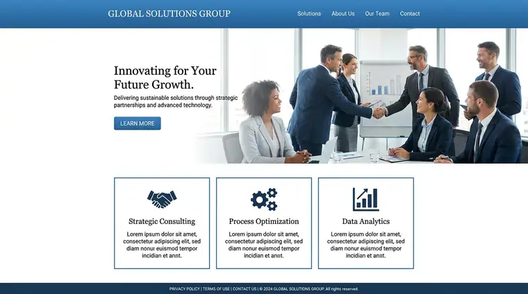
“We” is an organisation. No names, no faces, consistent rather than particular.
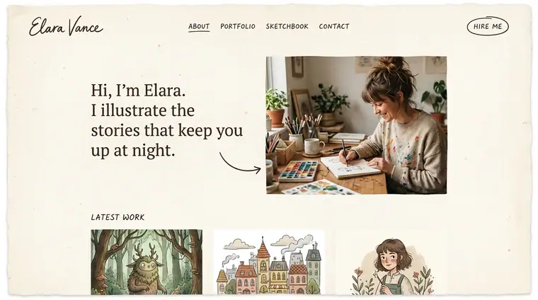
Personal
A named human is behind it — first person, their handwriting, their face, their opinions.
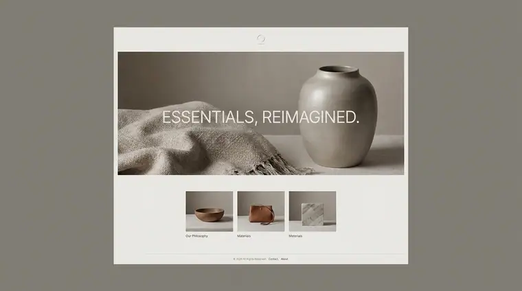
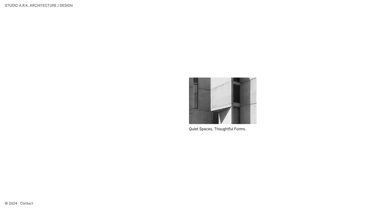
Understated
Small type, quiet colour, a lot left unsaid. It trusts you to come closer.
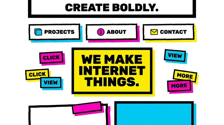
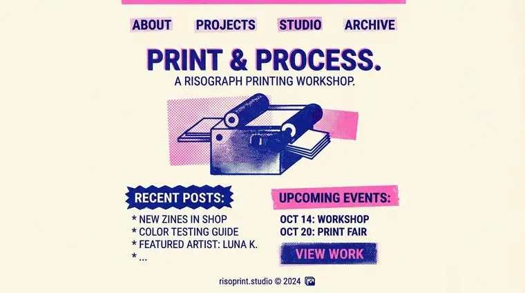
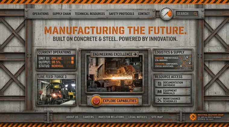
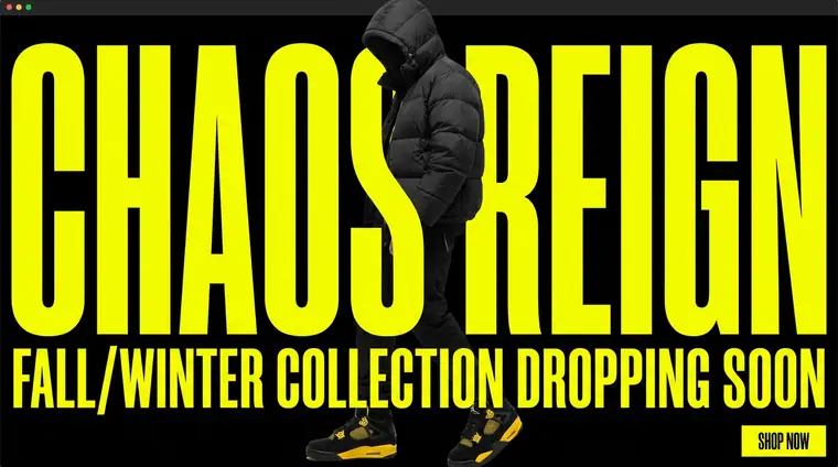
Bold
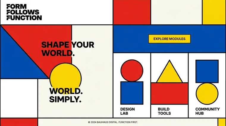
Large type, strong colour, high contrast. It takes a position and makes sure you see it.
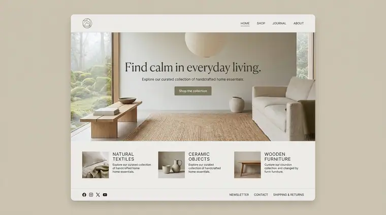
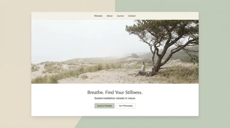
Calm
Slow transitions, an even rhythm, room to breathe between one idea and the next.
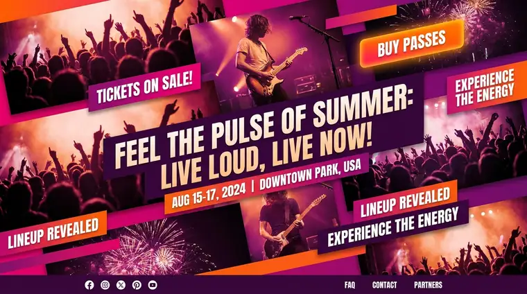
Energetic
Quick cuts, movement, saturated colour, several things happening at once.
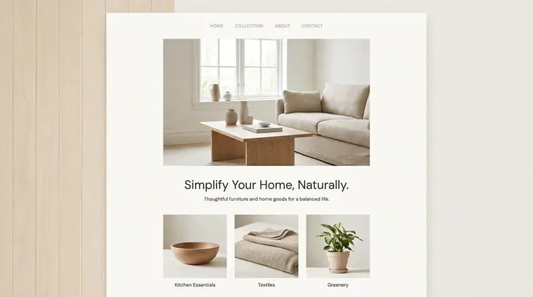
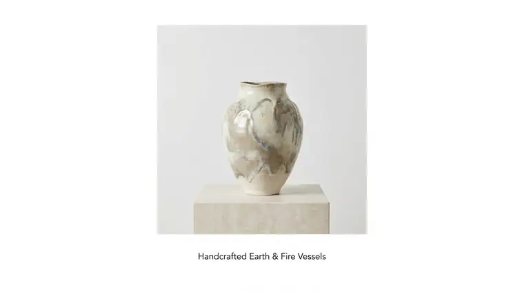
Spacious
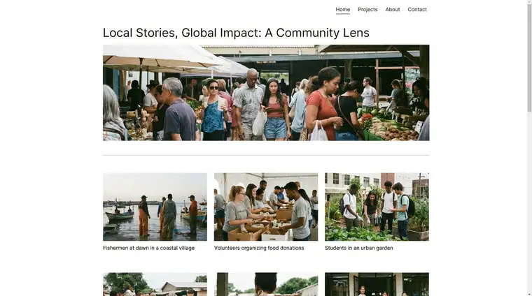
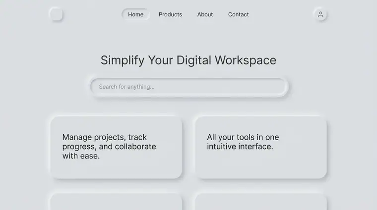
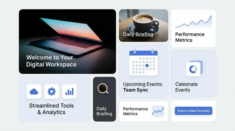
One idea per screen, wide margins, and a lot of empty space doing real work.
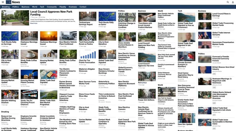
Dense
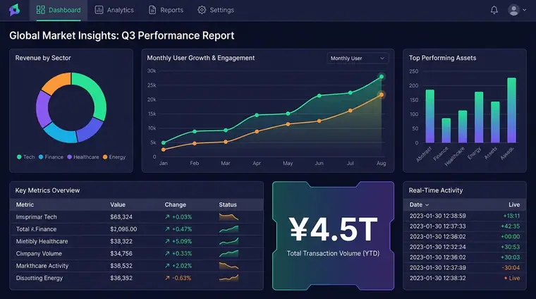
Many things visible at once, tight spacing, built for scanning rather than reading.
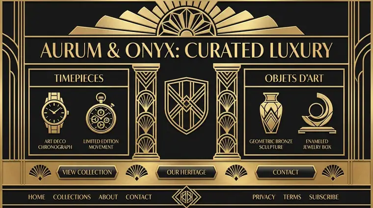
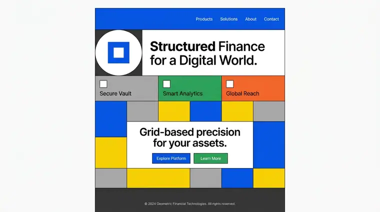
Geometric
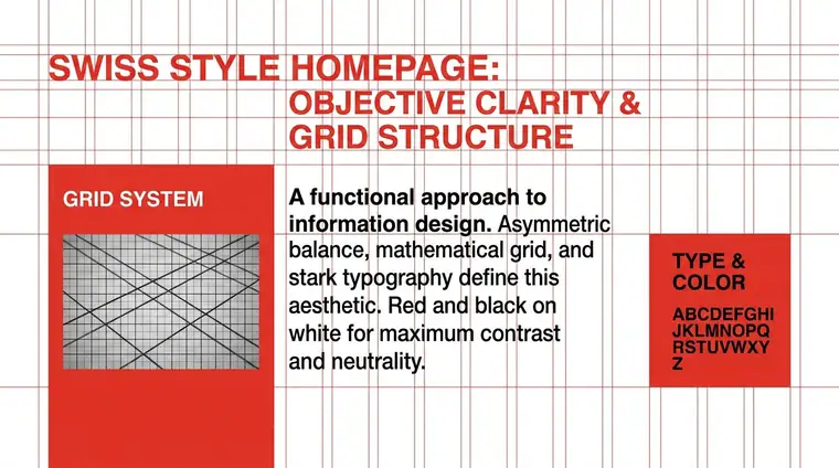
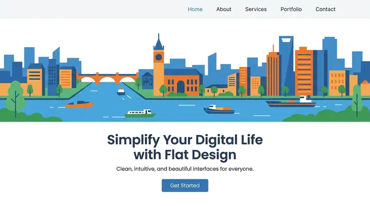
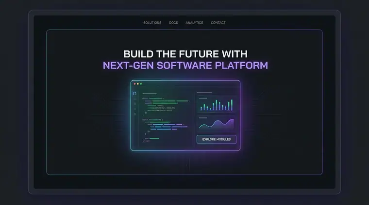
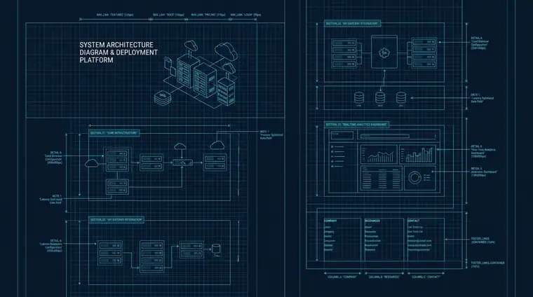
Straight edges, right angles, a visible grid — shapes you could draw with a ruler.
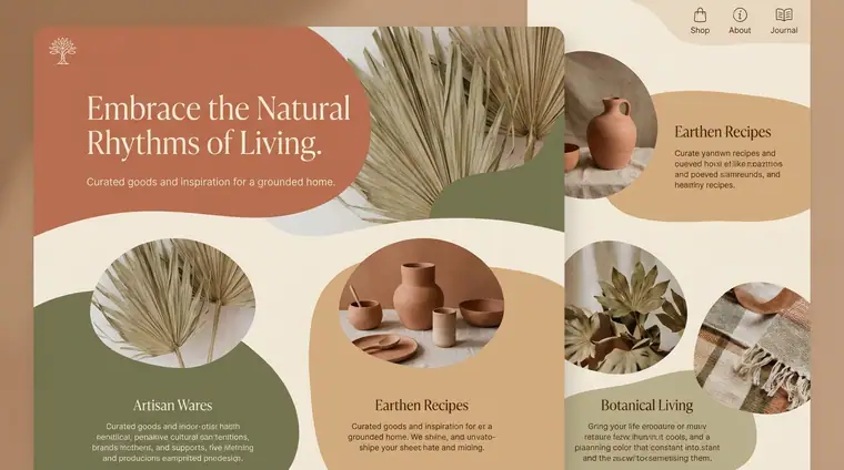
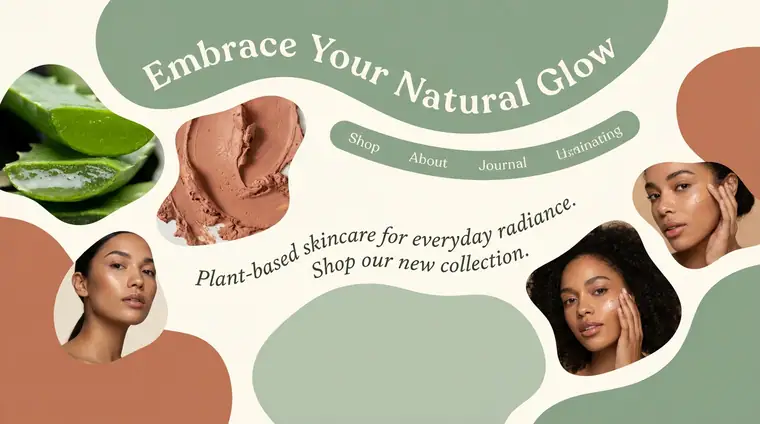
Organic
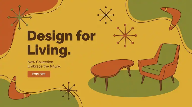
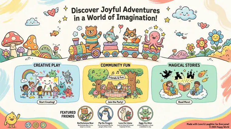
Curves, blobs and hand-drawn edges — shapes that look grown rather than constructed.
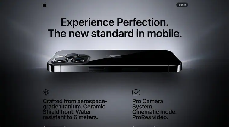
Polished
Even spacing, crisp edges, nothing out of place. It looks manufactured.
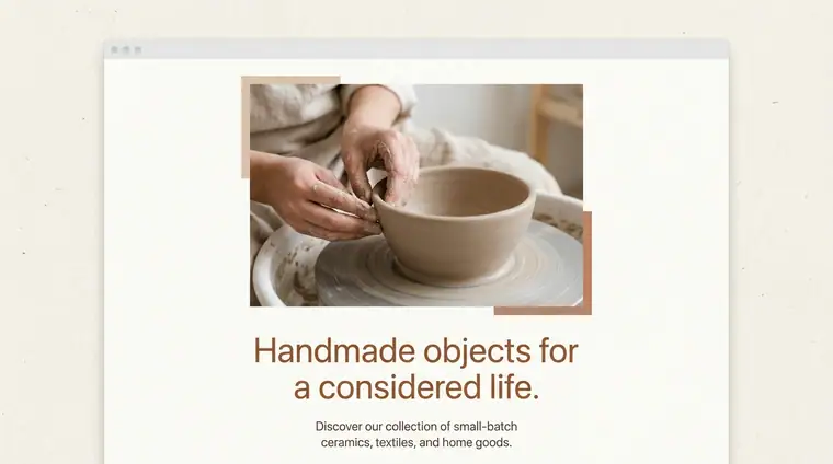
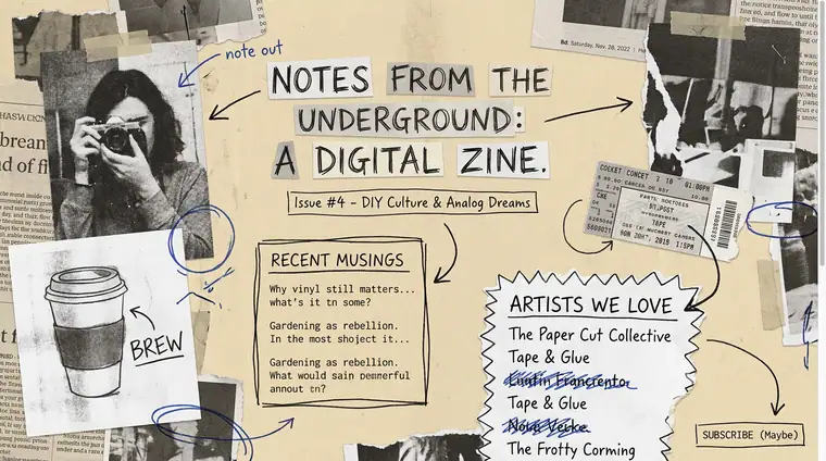
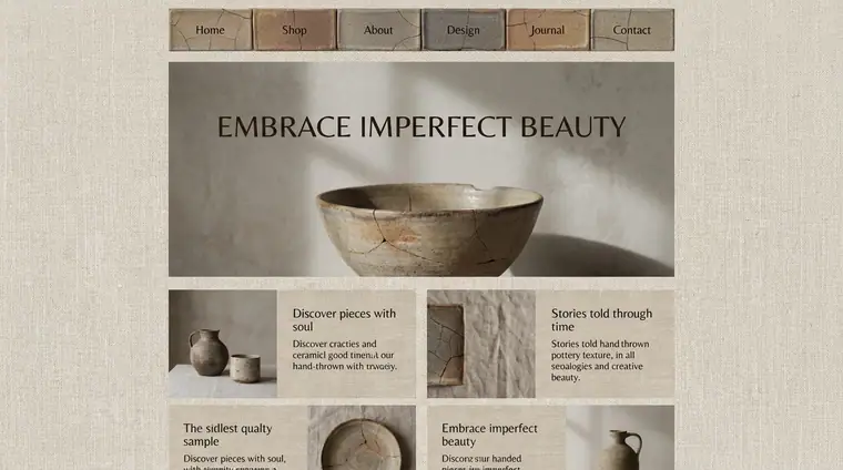
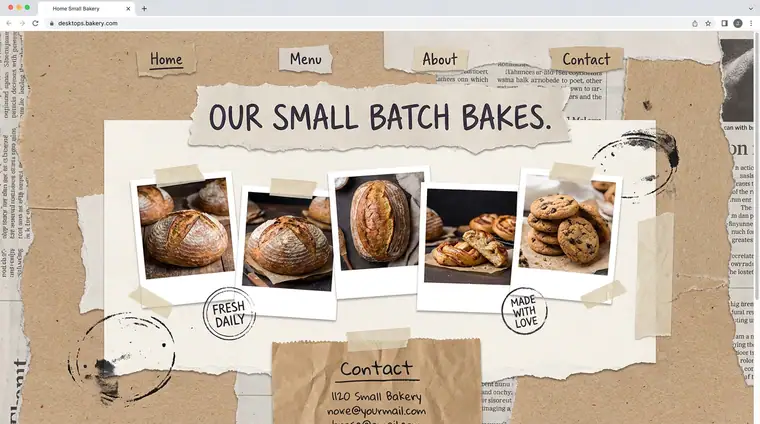
Handmade
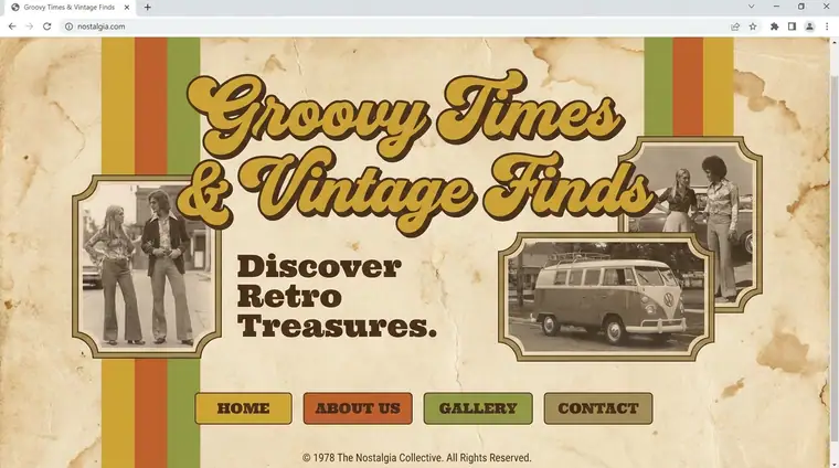
Texture, misalignment and visible craft are kept on purpose. You can tell a person made it.
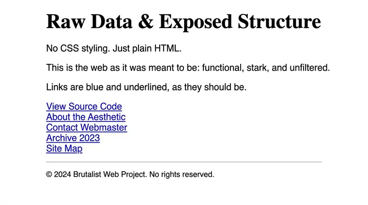
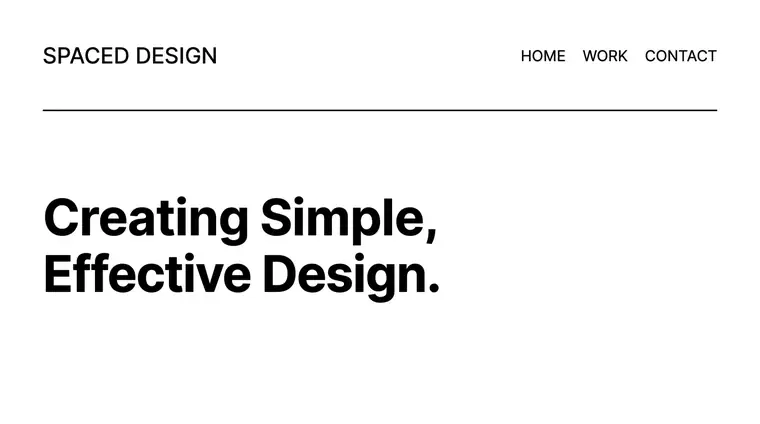
Minimal
Only what is needed. One or two colours, no ornament, no pattern.
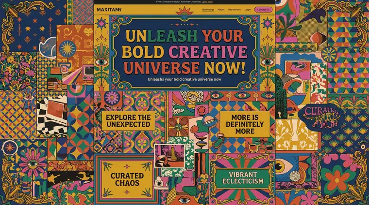
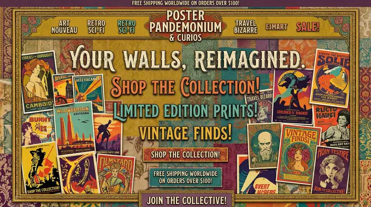
Maximal
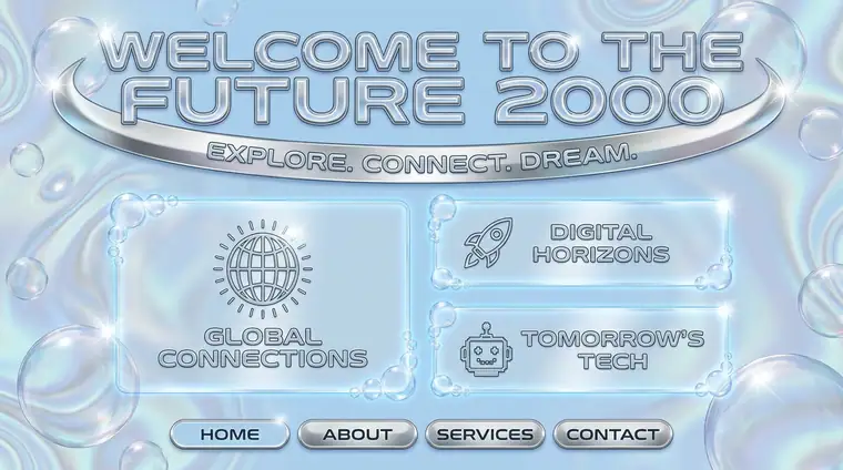
Layers of colour, pattern and ornament. More is the point, not an accident.
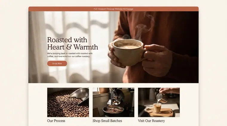
Warm
Reds, oranges, browns and creams. Reads as human, close and approachable.
Cool
Blues, greys and greens. Reads as calm, precise and a little distant.

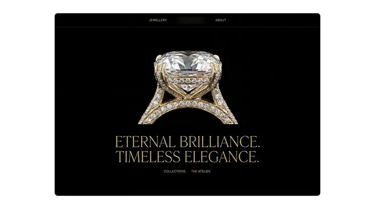
Premium
Restraint, space and slowness signal that it is not for everybody. Price is rarely the first thing you see.
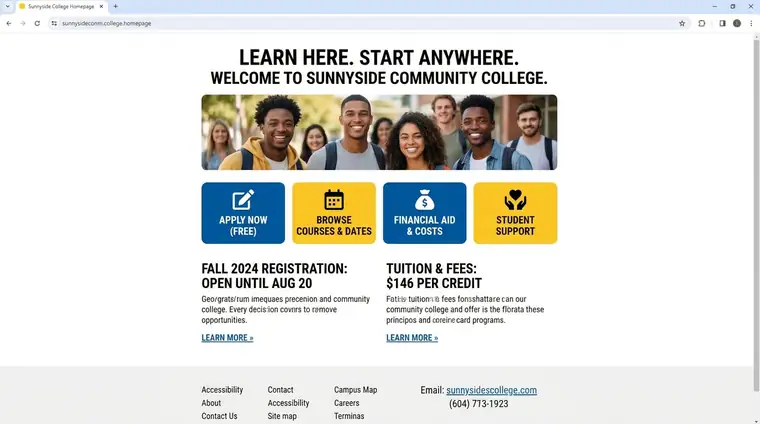
Accessible
Plain, open and easy to enter. Prices, options and the next step are stated upfront.
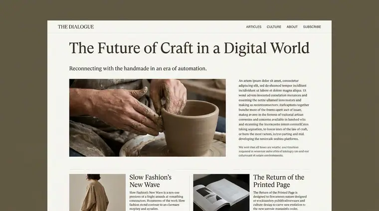
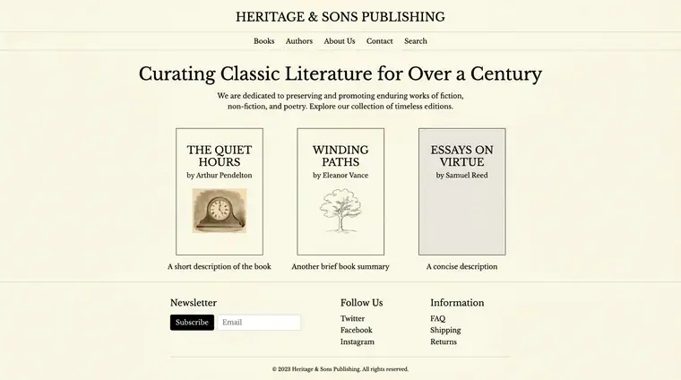
Timeless
Choices that will still read well in ten years. Nothing borrowed from this season.
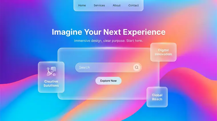
Trend-aware
Deliberately of its moment, and willing to be redone when the moment passes.
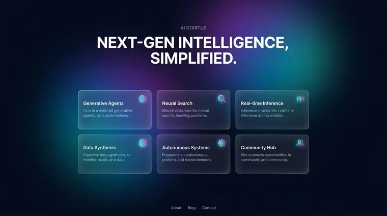
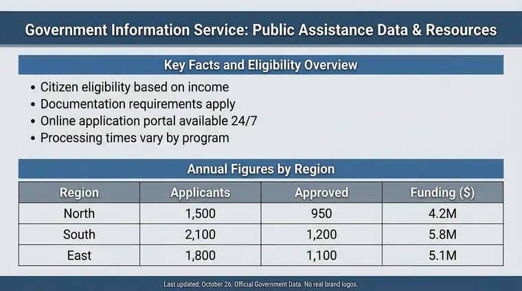
Informational
Built to be scanned. Headings, lists and figures — you can find one fact and leave.
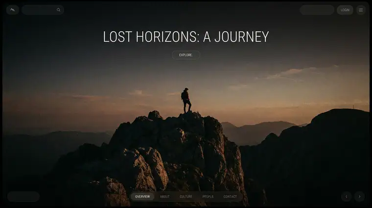
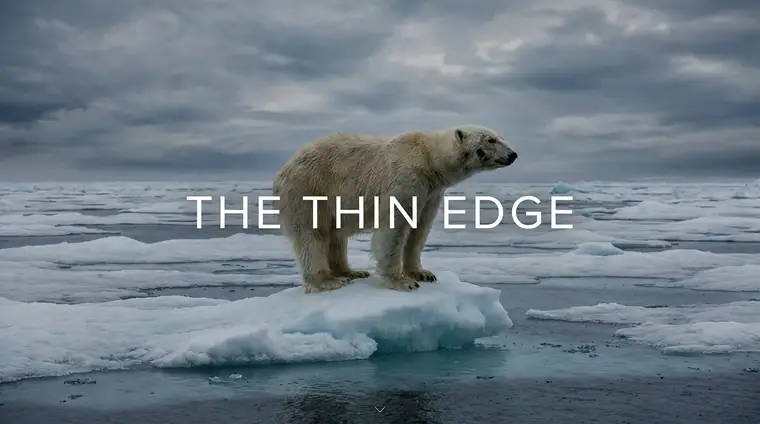
Immersive
Built to be moved through. Full-screen scenes and a sequence rather than a page.
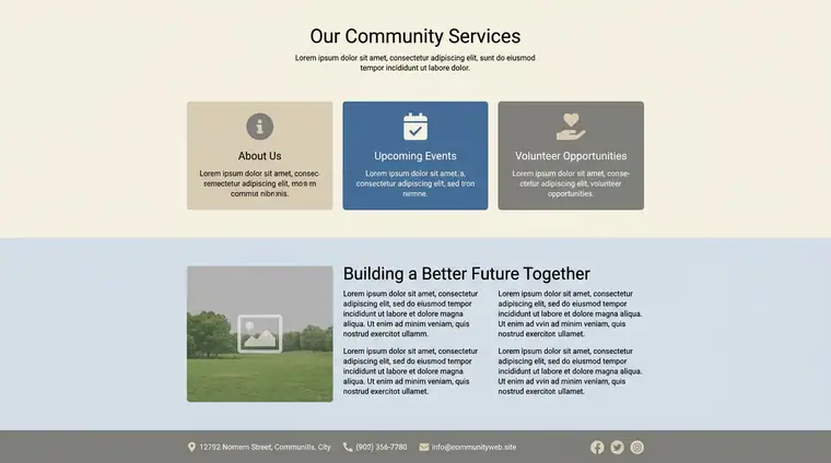
Static
Nothing moves unless you move it. The page is the same every time you look at it.
Cinematic
Time is part of the design — things enter, hold and leave, paced like a shot.
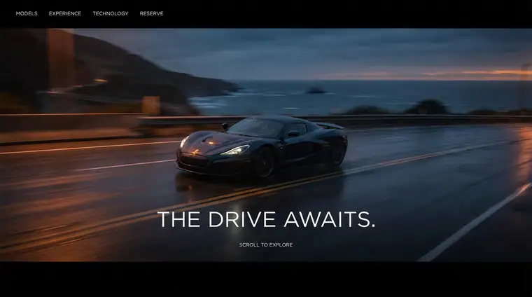
An aesthetic label is a shorthand for a whole look. Use one or two as anchors, then say which parts you want, because each label can mean several things.