
This is the chapter where your website takes shape. You plan your pages, choose your style and design every page, all before anything is built. It is also the most creative part of the guide, and the part that makes the biggest difference to the result.
What you will get
A beautiful design of your website as a clickable prototype, showing exactly what your website will look like once it’s live.
What you’ll do in this chapter
Designing your website takes six steps, in this order. Each one builds on the one before.
- 4.1Plan your pagesAbout 30 minutesWhich pages your website has and which sections go on each. Deciding the structure first gives your design something solid to build on.
- 4.2Write your first prompt and choose your styleAbout 1 hourThe first design of your homepage, in a style chosen on purpose. This sets the look of your whole website, and keeps it away from the generic look most AI-made websites have.
- 4.3Refine each page1.5 to 2 hoursEvery page, one at a time, until it works and looks right on computer and phone. Then you add your facts, such as prices, opening hours and reviews. Getting the design right now is quick, while changing it after building takes much longer.
- 4.4Write your text1.5 to 2 hours, spread over two or three daysYou rewrite the draft text yourself until it gets your key messages across, convinces visitors and sounds like you. It takes longer than any other step, and makes the most difference to whether visitors get in touch.
- 4.5Add your imagesAbout 1 hour, more if you take new photosThe right image for every spot in your design, from your own photos, stock or AI. Choosing them last means you know exactly what each image needs to show.
- 4.6Final checksAbout 30 minutesOne last look at the whole website, the way a visitor would see it, against a checklist of what every page needs. Fixing something now is one message; after building, it takes longer.
What you need
- The five questions your customers ask you most. Look through recent emails and messages if you are not sure.
- Two or three websites you like. They don’t have to be in your industry.
- Your best photos of your premises, your work and your team
- If you use them: Adobe Stock credits for paid stock photos, and one month of Higgsfield (about $15) for AI images
- Time to spread your writing over two or three days
4.1Plan your pages
About 30 minutes
What this is for
Before anything is designed, you decide which pages your website has and what goes on each one. Most people find this the hardest part to do alone, because it is difficult to know which sections a good website in your industry usually has. So you let Claude propose the structure, and you decide.
By the end of this section, you have a page plan: your pages, the sections on each from top to bottom, and the main action on every page. Along the way you also decide whether you need more than one language, and whether you want dark mode.
Know-how
Typical pages on a small business website
Most small business websites are built from the same handful of pages. You rarely need all of them. Use this table to check the plan Claude proposes.
A one-page website, where everything sits on the homepage in sections, is a perfectly good choice for a simple business. Legal pages, such as your privacy policy, come later, in chapter 6.
Step by step
- Ask Claude for a page plan. In your website project, start a new conversation, then send prompt P10 with your customers’ questions filled in. They help Claude decide what each page must answer.
Copy-paste prompt P10
Page plan
What this prompt does: Claude proposes which pages your website needs and what goes on each, based on your brief, your customers’ questions and what works in your industry.
Using my brief, propose a page plan for my website.

<questions>[PASTE THE QUESTIONS YOUR CUSTOMERS ASK MOST]
</questions>

1. List the pages my website needs, with one line on why
each is needed. Keep it to what a business like mine really
needs, usually one to five pages. If one page is enough, say
so.
2. For each page, list the sections from top to bottom, and
say what each section must get across.
3. Name the main action on each page and where it appears.
4. Use my customers' questions to decide what each page must
answer, and whether I need a questions section.
5. Base the plan on what works for websites in my industry.
6. Do not write the final text yet.

<format>
# Page plan: [business name]
## [Page name]: [why it is needed]
- Main action:
- Sections, top to bottom: [section]: [what it must get
across]
</format>
- Review the plan. Read it with three questions in mind:
- Does every section earn its place? If you can’t say why a visitor needs it, remove it.
- Is anything missing that your customers always ask about?
- Does every page lead to your website’s main job?
Compare it with the table of typical pages above, and ask Claude to change whatever doesn’t fit.
- Add something that makes your website special (optional). If one of the ideas in the box below these steps fits your business, ask Claude to add it to your plan, for example: “Add a service finder quiz to my homepage, in the place where it best helps visitors book.”
- Decide on languages and dark mode, and tell Claude. Two choices affect every page, so they belong in your plan now:
- Languages: do you need your website in more than one language? A second language affects every page, and Arabic, which reads from right to left, changes the whole layout.
- Dark mode: should your website switch to dark colors when a visitor’s phone is set to dark mode? This is a matter of style, and fine to skip.
Then tell Claude your choice in the same conversation, and ask it to add it to your page plan. For example: “My website needs to be in English and Arabic, and it doesn’t need dark mode. Please add this to the page plan.” If you need one language and no dark mode, say so too, so the plan is complete.
- Add the text you already have. If you have text you want to keep, such as your story, a description of a service or reviews, paste it in and tell Claude which section it belongs to.
- Save the page plan in your project. Ask Claude: “Save the final page plan as a document in this project’s files.” Check that it appears under Files, next to your brief.
Ideas to stand out
Features most websites don’t have
Claude builds a solid website by default, but it won’t add features like these unless you ask. One well-chosen feature can make your website memorable, and help visitors take the next step. Pick at most one or two, and only if they support your website’s main job.
Claude Code can build all of these as part of your website, without extra tools.
4.2Write your first prompt and choose your style
About 1 hour
What this is for
Your first design prompt sets the look of your whole website. Style is also where most AI-made websites go wrong: ask for “a modern website” and you get the same clean, safe, forgettable result as everyone else. So before you write that prompt, you choose a style on purpose, and learn how to describe it so AI creates what you have in mind.
By the end of this section, you have a first design of your homepage, in a style chosen on purpose. It sets the look for every other page. The aim is a website you are proud of, not one that looks like a template.
What goes into your first prompt
Prompt P11 below already asks for everything a good homepage needs, from the five-second test to a main action that stays visible on phones. You add what makes it yours: your style, websites you like and, if you have them, one or two of your best photos.
Your style
Different businesses need different things from their website. A law firm needs to look calm and credible. A design studio needs its website to prove it can design.
Know-how
Style words: Setting the direction
A few well-chosen words change a design more than a long description. Add one or two of these to your first prompt, and Claude Design takes your website in that direction.
Want more? The interactive website design dictionary on our website shows many more styles and design terms, each with examples: becomeamaister.com/designdictionary.
Websites you like
Two or three websites whose look you admire, in any industry, each with a few words on what you like about it. They show Claude Design what you mean far better than adjectives can.
Your photos
Optional: one or two of your best photos, such as your premises or your work, attached to the prompt. Seeing your own photos in the design helps you judge whether the style suits your business. If you don’t have strong photos yet, skip this. Claude Design leaves a placeholder that says what each image should show, and you add all your images in 4.5.
How to write good instructions
The difference between a generic design and one that feels like yours is in the details you give. Be specific: say what you want, and where it helps, why.
Step by step
Tip
Plan and design for phones first, known as mobile-first. More than six in ten website visits worldwide now come from a phone (62.5% in 2025, according to StatCounter), so for most of your visitors, the phone version is your website. When you look at your first design, start with the phone version: what visitors see first, and how far they have to scroll to reach your main action.
- Choose your style. Using the tables above, pick one or two style words that fit your business. Write them down: they go into your first prompt.
- Collect websites you like. Pick two or three websites whose look you admire, in any industry. Take a screenshot of each, and note in a few words what you like about it, such as the layout, the colors or the feel. You will add these to your first prompt.
- Start a design. In your website project, start a new conversation. In the message box, open Output and choose Design. Claude creates your design on a canvas next to the conversation.
- Write your first prompt. Ask for your homepage first, because it sets the style for everything else. Attach the screenshots of websites you like and, if you have them, one or two of your best photos. Then send prompt P11 with your choices filled in.
Copy-paste prompt P11
Create the homepage prototype
What this prompt does: Claude Design creates your homepage as a clickable prototype, for phone and computer, in the style you chose. You can click through it like a real website.
Create a clickable prototype of the homepage of my website,
following my brief, page plan and design system. Make the
menu and buttons clickable, so I can click through it like a
real website.

I would like the style to be [DESCRIBE YOUR STYLE
PREFERENCE, FOR EXAMPLE: WARM AND ORGANIC, WITH FILM GRAIN].

In terms of reference websites I like, look at [LINKS TO THE
WEBSITES AND SAY WHAT YOU LIKE ABOUT EACH EXAMPLE]. I have
attached screenshots of them.

1. Design it mobile-first: start with the phone version,
then adapt it for computer.
2. Follow the sections in my page plan, in order.
3. Use the photos I have attached. Where I have no photo,
add a placeholder labeled with what the image should show.
4. Write draft text in the voice described in my brief.
5. Within five seconds, a visitor must see what I do, who it
is for and what to do next.
6. Make the main action, [YOUR MAIN ACTION], easy to find,
and keep it visible at the bottom of the screen on phones.
7. Place my proof, such as reviews or my rating, close to
the main action.
8. Avoid the generic AI look: no stock gradients, abstract
blobs or vague headlines.
9. Take inspiration from the websites I like, but do not
copy them.
10. Where you have to make an assumption, make it and tell
me what you assumed.
- Look at it on phone and computer. Click through your prototype on the right, and check both versions. If one is missing, ask for it.

Your design in Claude Design. You talk to Claude on the left, and your clickable prototype appears on the right. Click the menu and buttons to move through it like a real website. - Explore other directions. If the first result isn’t quite right, try another style word. Claude Design doesn’t keep a version history yet, so ask Claude to save the current design before you try something different, so you can go back to it.
- Choose your direction. When the homepage feels like your business, you have your style. Every other page follows it.
- Make it stand out. Now try one or two of the ideas in the box below, such as a short looping video at the top or sections that appear as you scroll. Ask for one at a time, for example: “Add a short looping video at the top of the homepage, in the same style.” Keep what makes the page better, and undo what doesn’t.
Ideas to stand out
Ways to make it stand out
This is what separates a website you are proud of from one that merely works. Once your homepage has a direction, try one or two of these. One or two, done well, beat ten done half-heartedly. Interactive features, such as a quiz or a price calculator, are part of your page plan in 4.1.
Two cautions. Every effect makes a page heavier, so check that your website still loads quickly on a phone. And some visitors switch off animation on their devices, often because motion makes them feel unwell. Ask Claude Code to respect that setting, which it does easily.
4.3Refine each page
1.5 to 2 hours
What this is for
With the style set, you work through your pages one at a time, starting with the homepage, until each one is right. Getting the design right now is quick. Changing it after building takes much longer.
This section has two parts:
- Part 1: Refine and approve your design. Examples of feedback that works, an overview of everything you can change, and the steps for refining each page. You end with an approved design for every page.
- Part 2: Your content checklist and facts. With the design final, a list of everything you still need to provide, then your facts and reviews added to the design. The images follow in 4.5.
Part 1Refine and approve your design
Refining is a conversation. You look at a page, tell Claude Design what to change, look again, and repeat until it feels right. Expect several rounds per page: the first version is a starting point, not the result.
How good your design becomes depends mostly on how clearly you say what you want. So before the steps, two things help: examples of feedback that works, and the design words that tell Claude exactly what you mean.
Know-how
Feedback that works
Say what you see, why it doesn’t work, and what you want instead.
The better examples have one thing in common: they name exactly what should change. That is much easier when you know what things are called.
Know-how
Design vocabulary: Knowing what to ask for
Most people only ask for changes they can name, and you can change far more than you might expect. The table lists what you can ask Claude Design to change, with words to use and an example of each. You don’t need to know them all: pick the ones that touch what bothers you. If you can see what you want but can’t name it, look it up in the interactive website design dictionary, where every term comes with examples: becomeamaister.com/designdictionary.
Step by step
- Refine the homepage first. Use the conversation for big changes, such as a different layout or color scheme. For a small change to one element, click the comment button in the top right corner, click the element and type your comment. Keep Send to Claude ticked, so Claude makes the change. You can also drag and resize elements directly.
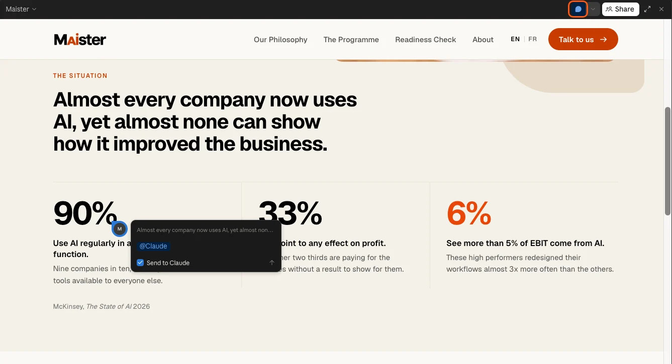
The comment button sits in the top right corner (highlighted). Click it, then click the element you want to change, type your comment and send it to Claude. - Add the next page. Ask Claude to add the next page from your page plan to the prototype, in the same style as the homepage, and to link it from the menu. Then refine it the same way.
- Design your form controls, if you have forms or booking. Ask Claude Design to design every dropdown, date picker and other control in your style, including how it looks when it is open. Otherwise your website uses the phone’s standard controls. Those always work and every visitor knows them, but they look different on every phone and rarely match your design. Custom controls look like part of your website, but they need careful testing on a phone, which you do in chapter 5.
- Check the basics as you go. Make sure the main action is easy to find on every page, and look at the phone version first. You check everything else in 4.6.
- Repeat until every page is done.
- Approve the design. When every page looks right, the design is done.
Part 2Your content checklist and facts
Now that every page is final, you know exactly what each section needs. Making the list now means you only gather what you will actually use. Then you give Claude the facts, so they are in place before you start writing in 4.4.
Step by step
- Ask Claude for your content checklist. In the conversation with your design, send prompt P12.
Copy-paste prompt P12
My content checklist
What this prompt does: Claude goes through your approved design and lists everything you still need to provide, from prices to photos, so nothing is missing.
My design is approved. Make a checklist of everything I
still need to provide to finish each page.

1. Go through every page and section of the design.
2. List the facts and text I need to give you or check, such
as prices, opening hours, team names or a service
description.
3. List which reviews or testimonials each section needs.
4. List every image: the page and section, what it should
show, its shape (wide, tall or square), whether it must be a
real photo of my business, and whether it is already in the
design or still a placeholder.
5. Check the files in this project and mark what I already
have.
6. Save it as a document called Content checklist in this
project's files.

<format>
# Content checklist: [business name]
## Facts and text
- [what], for [page and section]. Already have it: [yes or
no]
## Reviews
## Images
- [page and section]: [what it shows]. Shape: [wide, tall or
square]. Real photo needed: [yes or no]. In the design: [yes
or placeholder]
</format>
- Gather what’s missing. Collect the facts and reviews on your checklist. For reviews, choose three or four that say something specific, such as “I finally found a colorist who listens”, rather than “Great service”, and make sure you have permission to use them. The images come in 4.5.
- Add your facts to the design. In the conversation with your design, paste or attach your facts and reviews, and ask Claude to put each one in its place, exactly as you give it. For example: “Here are my prices and opening hours. Put them on the Services and Contact pages exactly as written. Use these three reviews on the homepage without changing their wording.”
- Check every fact. Go through each page and check prices, opening hours, addresses, names and promises. They have to be exactly right.
4.4Write your text
1.5 to 2 hours, spread over two or three days
What this is for
Your design already has draft text from Claude, and your facts are in place from 4.3. In this section you rewrite the words yourself, page by page. This is copywriting: writing text that makes people act. Expect it to take longer than any other step in this chapter. Spread it over two or three days if you can: text you wrote yesterday is much easier to judge than text you wrote an hour ago.
Your text has three jobs. It has to get your key messages across, convince a visitor to book or get in touch, and sound like you. Claude’s draft is a reasonable start, but it can only work with what is in your brief. You know which promise matters most to your customers, what makes them hesitate and how you actually talk. So in this section you do the writing, and Claude only sets up the editor you write in.
By the end of this section, every page has text you wrote yourself: clear about what you offer, convincing, and in your voice.
Know-how
What makes website text convincing
Visitors don’t read a website, they scan it to decide whether what you offer is worth it. It feels worth it when four things come across: the result they get is one they really want, it is likely to work for them, it comes quickly, and it takes little effort. Your text makes each of these clear, and then removes the reasons to wait.
- Start with the visitor, not with you. Write about their problem and what they want, not about your history or your methods. Count how often a page says “we” and how often it says “you”.
- Name the result they want. People don’t buy a haircut, they buy feeling good about how they look. Lead with that result, in your visitor’s words: “Hair color that suits you, and still looks good after six weeks” tells a visitor more than “Welcome to Studio Luna”.
- Make it believable. The bigger the promise, the more proof it needs. Put reviews, before-and-after photos, numbers and qualifications right next to your claims.
- Be specific. Numbers, names and real details are believable. “Quality service” and “a passionate team” are not, because every business says them.
- Show how quickly it happens. Say when the customer gets the result: “Appointments this week”, “A quote within 24 hours”, “Feel the difference after one session”.
- Show how little effort it takes. Spell out what you take off their hands: “Book online in under a minute. We remind you the day before.” Every step a visitor has to imagine is a reason to put it off.
- Take away the risk. Answer the doubts that make people hesitate, such as the price, the time or whether it is right for them, close to your main action. A guarantee you can keep, such as “Not happy? We fix it for free within a week”, removes the biggest doubt of all.
- Give an honest reason to act now. Limited places, a seasonal offer or a waiting list, but only when it is true. Visitors spot fake urgency, and it costs you their trust.
- Give every page one goal. Each section should move the visitor a step closer to your main action. If a section doesn’t, shorten it or remove it.
- Keep it short. Short sentences, short paragraphs and one idea per section. If a sentence still works without a word, cut the word.
Step by step
- Add a text editor to your prototype. In the conversation with your design, ask: “Add a text editor to this prototype, so I can click any text on the page and change it myself.” Then change one word and reload the page to check that your change is kept. If it disappears, ask Claude how to save your changes.
- Start with the headlines. Rewrite the headline at the top of each page first. Visitors read headlines before anything else, and many read nothing else. Within five seconds of arriving, a visitor should know from your homepage headline what you do and who it is for.
- Rewrite each section, from top to bottom. Use the principles in the box above: name the result, back it up with proof, and make it quick, easy and safe to say yes.
- Check it on a phone. Look at the phone version of each page. Headlines that run over four lines and sections that turn into walls of text need shortening.
- Let it rest, then test it. Read your text again a day later and fix what stands out with fresh eyes. Then show your homepage to a customer or a friend for five seconds, and ask what you do and what they would do next. If they can’t say, rewrite your headline. When every page reads well, all that is left is the images.
4.5Add your images
About 1 hour, more if you take new photos
What this is for
Images do more for your website than almost anything else. Now that your design and text are final, you know exactly which images you need, what each one should show and what shape it has to be. That makes choosing them much easier than guessing at the start.
This section has three parts:
- Part 1: Check your image list. The images on your content checklist from 4.3.
- Part 2: Choose where each image comes from. Your own photos, stock photos or AI-generated images.
- Part 3: Add them to your design.
By the end, every placeholder in your design has its final image.
Part 1Check your image list
Your content checklist from 4.3 already lists every image your design needs, with what it should show, its shape and whether it has to be a real photo.
Step by step
- Open your content checklist. In your project’s Files, open the content checklist and go to the images.
- Check the list. Cross off anything you would rather not have, and add any image you miss.
Part 2Choose where each image comes from
There are four places to get images. Each has its strengths:
More dots is better.
Most websites end up with a mix: your own photos for people, premises and work, and stock or AI images for backgrounds, textures and atmosphere. Images from different sources rarely look alike, so keep the mix deliberate, and ask for the same light and colors from each source.
Work through your image list in this order: your own photos first, then stock photos, then AI images for whatever is left. Save every image you collect in one folder on your computer, such as “Website images”, and give each file a name that matches your image list, such as home-team.jpg.
Your own photos
Use your own photos for everything your image list marks as a real photo: your team, your premises and your work. Their quality depends entirely on who takes them, so if a few key photos need to look professional, consider booking a photographer for one session.
Step by step
- Shoot in one session. Take all your new photos on the same day, in the same light, so they look like a set. Daylight from a window gives the most natural result.
- Match the shape on your list. Hold your phone sideways for wide images and upright for tall ones. Take several of each, so you have a choice.
- Move them to your computer. Use AirDrop on an iPhone and Mac, or upload them to Google Photos or iCloud Photos and download them on your computer. Save them in your website images folder.
Free stock photos: Unsplash
Unsplash has millions of free photos you can use on a business website without paying or asking permission. Crediting the photographer is appreciated, but not required. Claude can search Unsplash for you through its connector.
Step by step
- Create a free Unsplash account. Go to unsplash.com and click Join. Use your business email.
- Connect Unsplash to Claude. In your website project, click + in the message box, then Connectors, Add connector and Browse connectors. Choose Unsplash and click Connect. Sign in to Unsplash in the window that opens, and approve access.
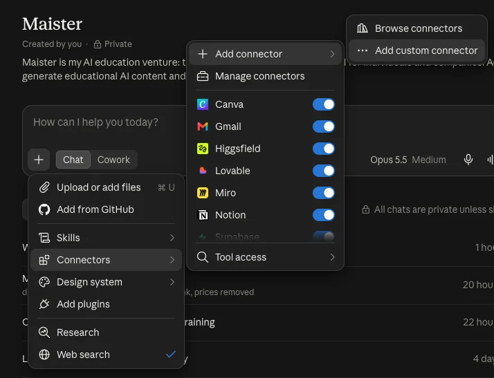
Click + in the message box, then Connectors. Here you find every connector with its own on and off switch, and Add connector to add a new one: Browse connectors for the directory, or Add custom connector for one that isn’t listed. - Ask Claude to find your photos. In your website project, start a new conversation and send prompt P13, with Unsplash filled in.
Copy-paste prompt P13
Find my stock photos
What this prompt does: Claude searches Unsplash or Adobe Stock for every stock image on your list and shows you options to choose from, in the style of your design.
Using the [UNSPLASH OR ADOBE STOCK] connector, find photos
for the images on my image list that will come from stock.

<images>[PASTE THE STOCK IMAGES FROM YOUR IMAGE LIST]
</images>

1. For each image, show me three options with a link to
each, in the right shape: landscape, portrait or square.
2. Choose photos that match the image style in my design
system, and that look like a set: similar light, colors and
mood.
3. Avoid photos that look staged, and photos marked
Unsplash+, which need a subscription.
4. Do not license or download anything until I have chosen.
On Adobe Stock, licensing uses my credits, so list the
photos I chose and ask me to confirm before you license
them.
- Choose and download. Claude can find photos, but it can’t download the files for you. Open the link of each photo you choose, click Download and save it in your website images folder with a name that matches your list.
Paid stock photos: Adobe Stock
Adobe Stock has higher-quality photos that fewer websites use, with a clear license for business use. Claude can search it and license photos for you through Adobe’s connector. For a one-off website, buy a small credit pack rather than a monthly plan: one credit is usually one photo.
Step by step
- Create an Adobe account and buy credits. Go to stock.adobe.com, sign in with an Adobe account or create one with your business email, and choose a credit pack that covers the photos on your list.
- Connect Adobe to Claude. Click + in the message box, then Connectors, Add connector and Browse connectors, and choose Adobe (it may be listed as Adobe for creativity). Click Connect, and sign in with your Adobe account.
- Ask Claude to find your photos. In your website project, send prompt P13 with Adobe Stock filled in, and choose from the options Claude shows you.
- Approve the licensing. Claude lists the photos you chose and asks you to confirm before it uses your credits. Check the list, then confirm.
- Download straight away. After licensing, Claude gives you a download link for each photo. The links only work for about an hour, so download each photo right away and save it in your website images folder.
Warning
Adobe Stock’s monthly plans are usually yearly contracts, paid monthly, with a fee if you cancel early. If you only need images for one website, a one-time credit pack avoids that. Check the terms before you pay.
AI images and video: Higgsfield
Higgsfield creates images and short videos from a description, using many different AI models in one place. Because you describe every image in the same style, AI images give you the most consistent look of all four sources. They work best for images without people: products, interiors, food, landscapes, textures and backgrounds. You connect Higgsfield to Claude, so Claude can write the image prompts for you.
Step by step
- Create a Higgsfield account. Go to higgsfield.ai and sign up with your business email. Choose a paid plan: connecting Higgsfield to Claude needs one. About $15 for one month is enough for a small website. Each image or video uses credits from your plan.
- Connect Higgsfield to Claude. Click + in the message box, then Connectors, Add connector and Add custom connector. Name it Higgsfield, and paste this address:
https://mcp.higgsfield.ai/mcp. Click Connect, sign in to Higgsfield when asked, and allow access. - Ask Claude to create your images. In your website project, start a new conversation and send prompt P14 with the AI images from your list. If Claude doesn’t use Higgsfield, check that the connector is switched on: click + in the message box, then Connectors, and make sure the switch next to Higgsfield is on.
Copy-paste prompt P14
Create my AI images
What this prompt does: Claude uses Higgsfield to create the AI images on your list, all in the same style.
Using Higgsfield, create the images on my image list that
are marked for AI.

<images>[PASTE THE AI IMAGES FROM YOUR IMAGE LIST]</images>

The style I want for every image: [DESCRIBE YOUR IMAGE
STYLE, FOR EXAMPLE: SOFT DAYLIGHT, WARM BEIGE TONES, SUBTLE
FILM GRAIN]

1. Write one detailed image prompt per image, and use
exactly the same style description in every prompt, so the
images look like a set.
2. Use the right shape for each image: wide (16:9), tall
(4:5) or square (1:1).
3. Create one image first and show it to me. Only create the
rest once I am happy with the style.
4. Prefer scenes without people. Where a person is needed,
keep them small or out of focus. Never create real,
recognizable people, or images that show the results of my
own work.
5. For each image, tell me its name or prompt, so I can find
it in my Higgsfield account.
- Approve the style, then create the rest. Claude shows you the first image. Ask for changes until the style is right, then let it create the others.
- Check every image closely, especially any with people. Zoom in. AI still makes mistakes, most often with people: extra or oddly shaped fingers, faces or eyes that look slightly wrong, and bodies in unnatural poses. Also look for garbled text or signs and objects that melt into each other. Ask Claude to recreate any image that isn’t right. If an image with people keeps going wrong, use a real photo instead.
- Download your images from Higgsfield. Claude can’t pass the images it created straight into your design. Go to higgsfield.ai, open your library of creations, download each image and save it in your website images folder. You will attach them to your design in part 3.
- Optional: a short video. If your design has a looping video, for example at the top of the homepage, ask Claude to create it in Higgsfield too. A few seconds of slow, simple movement works best, and keeps your website fast.
- Cancel your plan. Once you have all your images, cancel your Higgsfield subscription so you are not charged again.
ChatGPT, which you already used for your logo and mood board, can also create images. It works for the occasional one-off image, but it isn’t a good choice for a full set: you create and download each image one at a time, there is no way to make them in bulk, and keeping the same style across many images is harder.
Warning
Never use AI-generated images to show the results of your own work, such as a haircut, a treatment or a renovation. Customers will expect what they see, and it misleads them. When you use AI images elsewhere on your website, say so, for example in a small caption. In the EU, businesses have had to disclose AI-generated images that look like real people, places or events since August 2026. Rules differ by country, so check what applies to you. This is not legal advice.
Part 3Add them to your design
Step by step
- Attach your images. Open the conversation with your design. Click the attachment button in the message box, select the images from your website images folder, and say which placeholder each one replaces, using the names from your image list. Attach a few at a time rather than all at once.
- Check every page on phone and computer. Look for images that are cut off in the wrong place, look out of style next to the others, or make the text hard to read.
- Label your AI images. Ask Claude to add a small caption, such as “Image created with AI”, to every AI-generated image, as described in the warning above.
4.6Final checks
About 30 minutes
What this is for
Before Claude Code builds your website, you check the whole design once more, the way a visitor would see it. A problem you find now is one message to Claude Design. Once the website is built, the same fix takes longer.
By the end of this section, your design is final and ready to build.
What every page needs
- The five-second test. Within five seconds of arriving, a visitor knows what you do, who it is for, where you are if you are local, and what to do next. The top of your homepage has to pass this test.
- Final content everywhere. No placeholders or draft text left, every image in place, and every fact checked.
- Trust signals. Reviews, real faces, qualifications, client logos and a visible address or phone number, close to your main action. For a small business, these often decide whether someone gets in touch.
- Clear calls to action. Buttons that say what happens, such as “Book a consultation” rather than “Submit”. Your main action is repeated further down the page, and on phones a Call, WhatsApp or Book button stays visible at the bottom of the screen.
- Simple navigation. A menu of five items at most, and a footer, the strip at the bottom of every page, with your contact details, opening hours, address, social media links and legal pages.
- Every link and button works. Each menu item and button goes to the right page or section.
- Works on phones. Most visitors to a small business website arrive on a phone, so the phone version of every page matters most.
- Easy to read and skim. Clear headings, short paragraphs, text large enough to read without zooming, and enough contrast between text and background.
- One consistent look. The same fonts, colors, button style and spacing on every page.
- Short forms. Only the fields you really need. Every extra field loses people.
- Designed form controls. Every dropdown, date picker and other control is designed in your style, including how it looks when open.
- Speed. Visitors leave slow websites, and Google ranks them lower. Large images and long videos are the usual cause.
- Usable by everyone. Images described for people who can’t see them, a website that works with a keyboard alone, and colors that work for people with color blindness.
- Nothing that annoys. No pop-ups the moment someone arrives, image carousels that rotate on their own, videos that play with sound, more than two fonts, or cookie banners that cover the whole page.
Step by step
- Click through your website as a visitor. Start on the homepage of the phone version and click every menu item and button. Then do the same on the computer version.
- Go through the checklist, page by page. Note everything that doesn’t pass.
- Fix what you found. Ask Claude Design for each change, as in 4.3. Check the page again after every fix.
- Approve your final design. When every page passes, your design is ready to build.
Take a moment to look at what you have made. Every page of your website exists, in your style, with your words and your images, on computer and phone. Most people never get this far with a website, and you did it without writing a line of code.
In chapter 5, Claude Code turns your design into a real, working website.
Time to bring it to life!
Sources, checked October 2026. Claude Design: Claude Help Center. Higgsfield and Claude: Higgsfield Help Center. ChatGPT free image limits: CometAPI. EU rules on AI-generated content: Cooley and Stibbe. Share of website visits from phones: Statista, based on StatCounter.